Mandy Spaltman — Data Visualization & Information Design
Bringing your data, research & other complex information to life through intentional and human-centred visualizations and infographics.
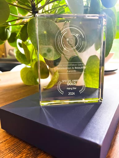
Information Is Beautiful Awards · June 2025
Rising Star of the Year
I was honored to receive the Rising Star award during the Information is Beautiful Awards ceremony of 2025 hosted by the Data Visualization Society. The judges stated:
“I was really impressed with the quality and breadth of Mandy’s work… Her portfolio already carries the mark of a seasoned professional, which only makes her recognition as a Rising Star all the more exciting.”
What I offer
Data Visualizations and Infographics
Meaningful, visually engaging data stories from one-off infographics to full research reports and executive summaries.
Data Storytelling Consultancy
Elevating your existing data-driven materials through visualization best practices and cognitive design principles.
Flourish Support
Turning static insights into interactive stories as part of the international Flourish Expert Network.
Workshops and Speaking Engagements
Workshops, lectures, and keynotes that strengthen teams’ visualization and data storytelling capabilities.
Clients & collaborators


Let’s work together
Have a project in mind? I’d love to hear about it.
Get in touch